Gutenberg Gallery Block Tutorial

Introduction

Gutenberg Gallery Block by Premium Blocks offers a powerful and flexible solution for showcasing your media content, such as images and videos, in a visually appealing grid layout. Designed to enhance user engagement and improve content organization, this block provides a range of customization options to fit any website design. Whether you need to create dynamic portfolios for photographers, designers, and artists; product showcases for e-commerce sites; blog image galleries to enhance posts; or corporate websites to feature company events, team member profiles, and project showcases, Gutenberg Gallery Block ensures a professional and engaging display in the WordPress editor. This versatile Media Grid is an excellent addition to any Gutenberg editor setup.

Requirements

  • Premium Blocks for Gutenberg – The Free WordPress Plugin.
  • Recommended* Kemet Full-Site-Editing WordPress Theme.

How to Use Gutenberg Gallery Block?

Once you’ve enabled Premium Blocks, adding Gutenberg Gallery Block to your Gutenberg editor is straightforward. From there, you can easily customize its various settings.

General Settings

  • Layout: Choose the layout style (e.g., Metro).
  • Image Fit: Select how images should fit within the gallery.
  • Image Size: Choose the size of the images.
  • Load More Button: Toggle to show a “Load More” button when the number of images exceeds a certain amount.
  • Button Text: Customize the text for the “Load More” button.
Gutenberg Gallery Block General Settings
Gutenberg Gallery Block – General Settings

Layout Settings

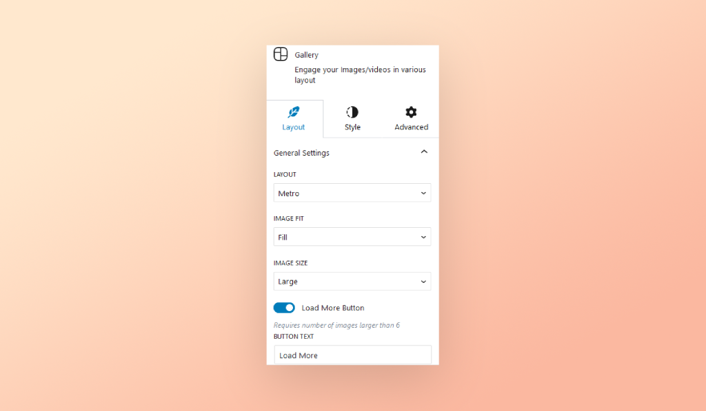
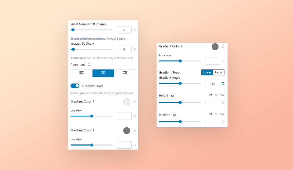
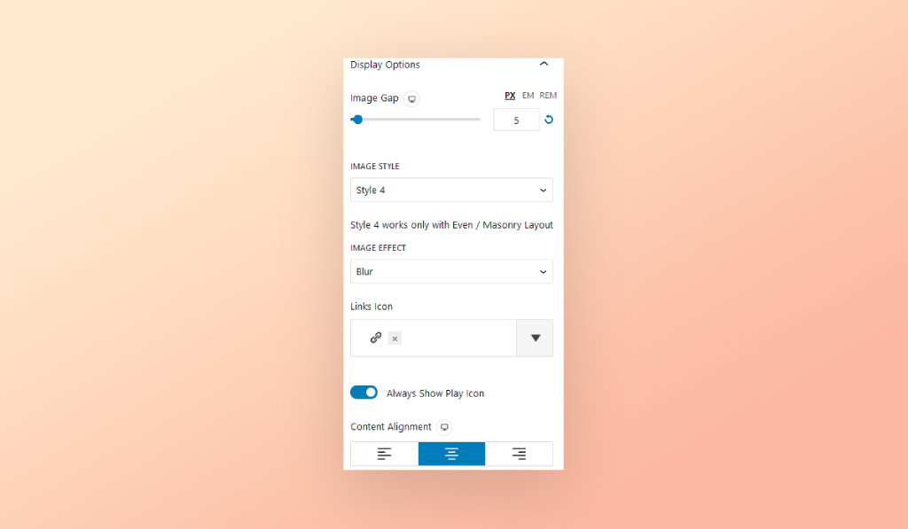
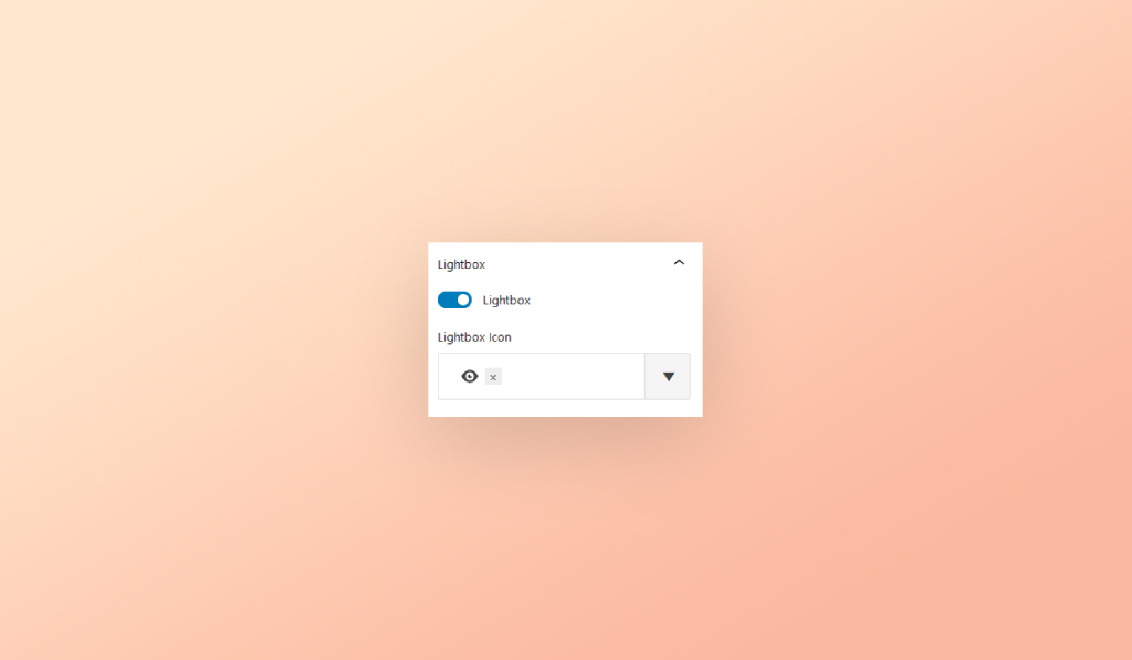
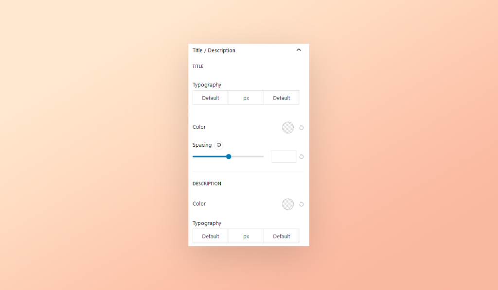
Adjust the layout and display options for the media gallery:

  • Initial Number Of Images: Set the initial number of images displayed.
  • Images To Show: Set the number of images to show.
  • Alignment: Choose the alignment of the media grid.
  • Gradient Layer: Toggle to add a gradient layer over the grid container.
  • Gradient Colors: Select gradient colors and their locations.
  • Gradient Type: Choose between Linear and Radial gradient types.
  • Height: Set the height of the grid.
  • Position: Adjust the position of the grid.
Gutenberg Gallery Block Layout Settings
Gutenberg Gallery Block – Layout Settings

Categories

  • Filter Tabs: Toggle to show filter tabs.
  • First Filter: Toggle to enable the first filter.
  • First Filter Label: Set the label for the first filter.
  • Add New Item: Add new categories for filtering.
  • Shuffle Images on Filter Click: Toggle to shuffle images when a filter is clicked.
  • Category Alignment: Choose the alignment of category filters.
Gutenberg Gallery Block Categories Settings
Gutenberg Gallery Block – Categories Settings

Images

  • Width: Set the width of the images (works with Metro layout).
  • Height: Set the height of the images (works with Metro layout).
  • Get Title/Description From Media Library: Toggle to automatically fetch the title and description from the media library.
  • Title: Set a custom title for the image.
  • Description: Set a custom description for the image.
  • Select Category: Assign a category to the image.
  • Link URL: Set a custom link URL for the image.
  • Whole Image Link: Toggle to make the whole image a clickable link.
  • Whole Image Lightbox: Toggle to enable a lightbox for the entire image.
Gutenberg Gallery Block Image Settings
Gutenberg Gallery Block – Image Settings

Display Options

  • Image Gap: Set the gap between images.
  • Image Style: Choose an image style (works with Even/Masonry layout).
  • Image Effect: Select an effect for the images.
  • Links Icon: Choose an icon for the links.
  • Always Show Play Icon: Toggle to always show a play icon.
  • Content Alignment: Adjust the alignment of the content.
Gutenberg Gallery Block Display Options Settings
Gutenberg Gallery Block – Display Options Settings

Lightbox

  • Lightbox: Toggle to enable the lightbox feature.
  • Lightbox Icon: Choose an icon for the lightbox.
Gutenberg Gallery Block – Lightbox Settings

Style Gallery Block

General Style

  • Background Type: Choose the background type for the gallery.
  • Border: Set the border style for the gallery.
  • Border Radius: Adjust the border radius for the gallery.
  • Box Shadow: Apply a box shadow to the gallery.
  • Margin: Set the margin around the gallery.
  • Padding: Set the padding inside the gallery.
Gutenberg Gallery Block – General Style

Image Style

  • Hover Overlay Color: Set the hover overlay color for images.
  • Border: Set the border style for images.
  • Border Radius: Adjust the border radius for the gallery.
  • Box Shadow: Apply a box shadow to images.
  • Margin: Set the margin around images.
  • Padding: Set the padding inside images.
Gutenberg Gallery Block - Image Style
Gutenberg Gallery Block – Image Style

Title/Description Style

  • Typography: Set the typography for titles and descriptions.
  • Color: Choose the color for titles and descriptions.
  • Spacing: Adjust the spacing between titles and descriptions.
Gutenberg Gallery Block - Title Style
Gutenberg Gallery Block – Title Style

Container Style

  • Background Type: Choose the background type for the container.
  • Border: Set the border style for the container.
  • Border Radius: Adjust the border radius for the container.
  • Text Shadow: Apply a text shadow to the container.
  • Box Shadow: Apply a box shadow to the container.
  • Margin: Set the margin around the container.
  • Padding: Set the padding inside the container.
Gutenberg Gallery Block - Container Style
Gutenberg Gallery Block – Container Style

Icon Style

  • Position: Set the position of the icons.
  • Size: Adjust the size of the icons.
  • Color: Choose the color for icons.
  • Background Color: Set the background color for icons.
  • Border: Set the border style for icons.
  • Border Radius: Adjust the border radius for icons.
  • Box Shadow: Apply a box shadow to icons.
  • Margin: Set the margin around icons.
  • Padding: Set the padding inside icons.
Gutenberg Gallery Block Icon Style
Gutenberg Gallery Block – Icon Style

Filter Style

  • Typography: Set the typography for filters.
  • Color: Choose the color for filters.
  • Background Color: Set the background color for filters.
  • Border: Set the border style for filters.
  • Border Radius: Adjust the border radius for filters.
  • Box Shadow: Apply a box shadow to filters.
  • Margin: Set the margin around filters.
  • Padding: Set the padding inside filters.
Gutenberg Gallery Block - Filter Style
Gutenberg Gallery Block – Filter Style

Button Style

  • Typography: Set the typography for buttons.
  • Color: Choose the color for buttons.
  • Spinner Color: Set the spinner color for buttons.
  • Text Shadow: Apply a text shadow to buttons.
  • Background Type: Choose the background type for buttons.
  • Border: Set the border style for buttons.
  • Border Radius: Adjust the border radius for buttons.
  • Box Shadow: Apply a box shadow to buttons.
  • Margin: Set the margin around buttons.
  • Padding: Set the padding inside buttons.
Gutenberg Gallery Block - Button Style
Gutenberg Gallery Block – Button Style

Advanced Tab Controls

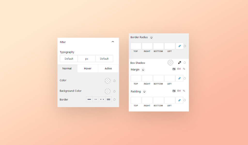
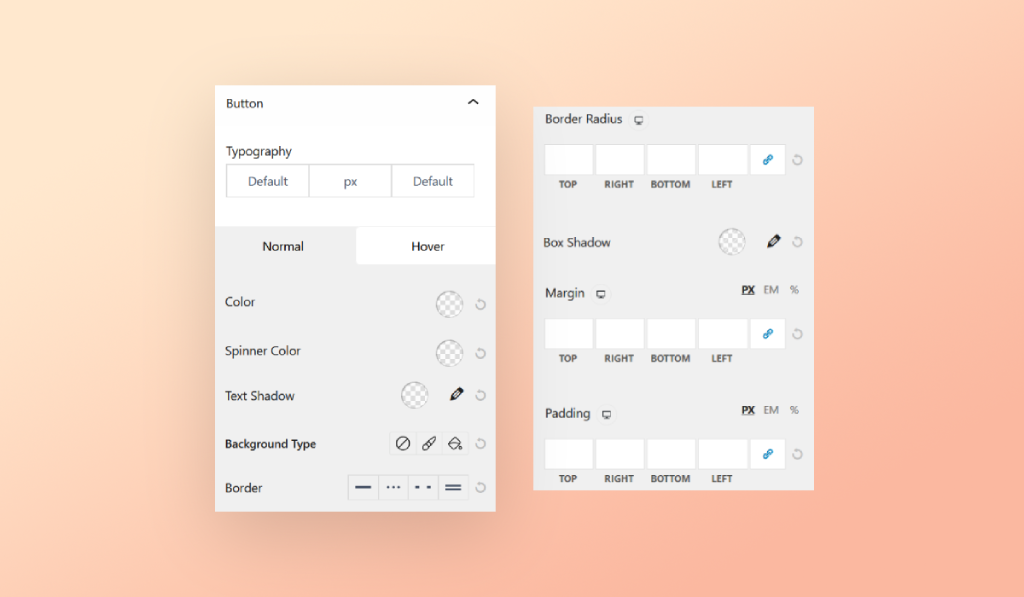
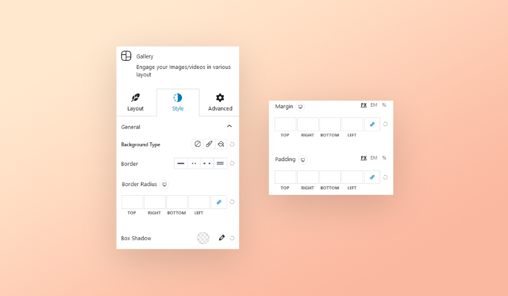
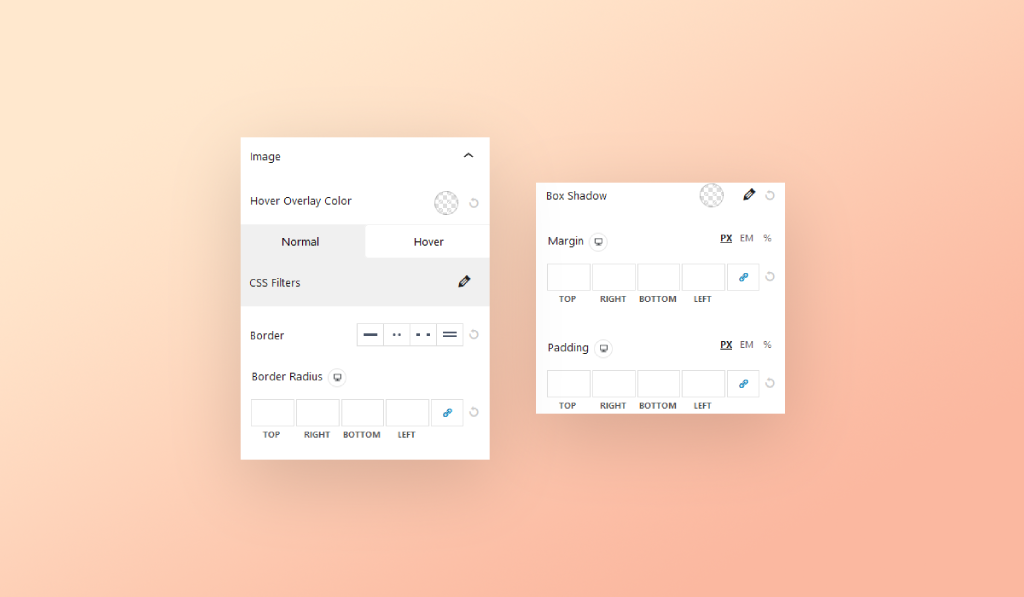
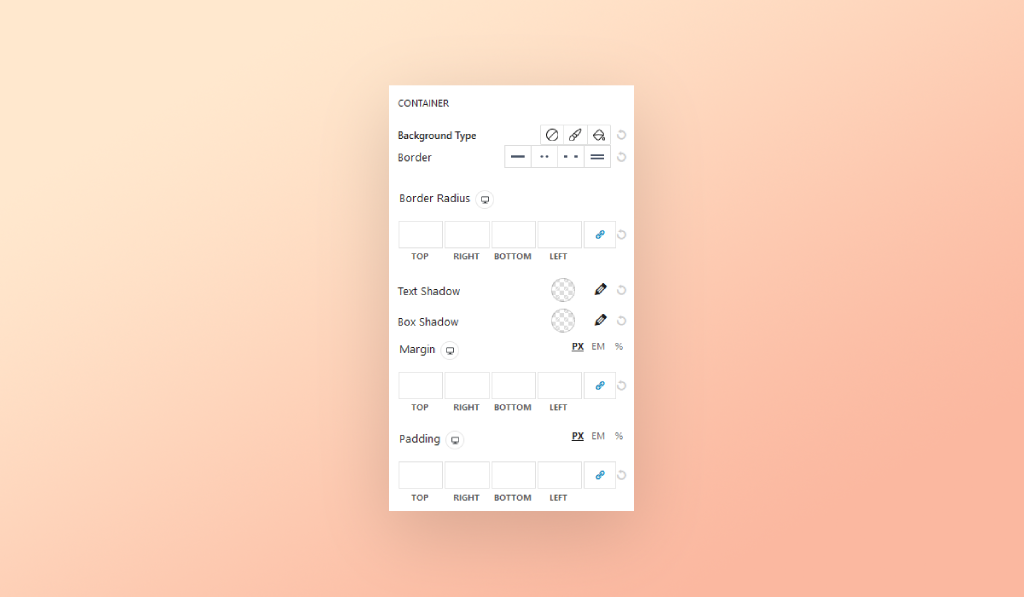
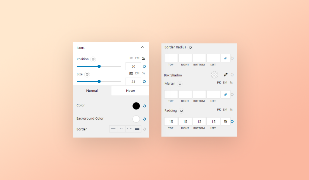
Get detailed information about how you can use the controls located within the Advanced Tab area like Layout Settings, Responsive controls for all screens, and more! All of those controls are available to be used with all of the blocks relevant to Premium Blocks—the FREE WordPress plugin for Gutenberg editor.

Conclusion

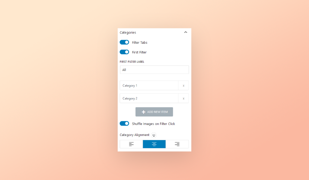
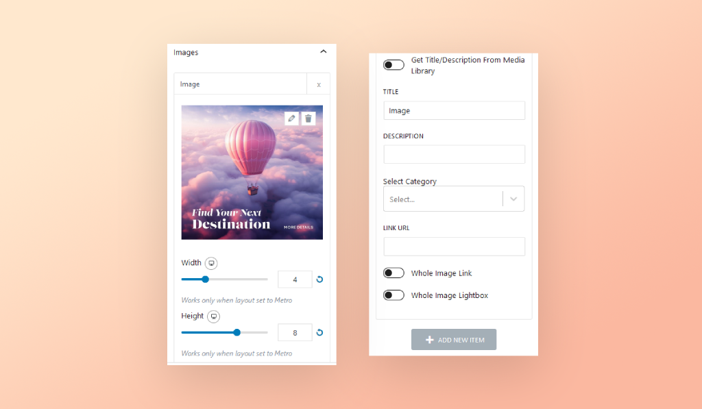
Gutenberg Gallery Block by Premium Blocks is a powerful tool for creating visually appealing media galleries on your website. It offers extensive customization options, making it suitable for various websites, including portfolios, e-commerce, blogs, and corporate sites. With interactive features like lightbox and category filters, it enhances user engagement. High-quality image display and organization improve your site’s overall look and professionalism. Whether showcasing a portfolio, presenting products, or enhancing blog posts, Gutenberg Gallery Block provides the flexibility and control needed for professional results.

Need Further Help?

Have a question or need assistance? Our dedicated support team is here to help! Explore our contact options to ensure you get the support you need. We’re committed to making your Gutenberg website-building experience seamless and resolving any queries you may have.

About Leap13

Leap13 is a WordPress-focused web development firm specializing in building premium WordPress themes and plugins.

Copyright © 2024 | Built With ❤️ Using Kemet WordPress Theme and Premium Blocks